
Snackpass


Snackpass


Snackpass

Role
Role
UX Designer and Researcher
UX Designer and Researcher
Collaborator (S)
Collaborator
Cate
Cate
SKILLS
SKILLS
UX/UI Design
Prototyping
User Research
UX/UI Design
Prototyping
User Research
Project Overview
Project Overview
Redesigning Snackpass to improve usability and personalize the food-ordering experience
Redesigning Snackpass to improve usability and personalize the food-ordering experience


The original Snackpass app featured a cluttered interface that made it difficult for users to navigate and explore available options. This led to frustration, limited engagement, and a lack of trust in the overall experience.
The original Snackpass app featured a cluttered interface that made it difficult for users to navigate and explore available options. This led to frustration, limited engagement, and a lack of trust in the overall experience.
Beyond usability, the app also lacked personalization features that would allow users to customize orders based on their dietary needs or preferences. The absence of tailored recommendations further weakened engagement and limited Snackpass’s ability to compete and grow in the crowded food-ordering market.
Beyond usability, the app also lacked personalization features that would allow users to customize orders based on their dietary needs or preferences. The absence of tailored recommendations further weakened engagement and limited Snackpass’s ability to compete and grow in the crowded food-ordering market.
The Current Space
The Current Space
In the competitive food-ordering market, personalization and clarity drive user loyalty
In the competitive food-ordering market, personalization and clarity drive user loyalty
As food-ordering apps continue to grow, users now expect intuitive navigation and personalized experiences that reflect their individual preferences. Snackpass’s lack of customization, unclear interface, and limited recommendations made it difficult to stand out among competitors who prioritize user control, tailored options, and seamless ordering.
As food-ordering apps continue to grow, users now expect intuitive navigation and personalized experiences that reflect their individual preferences. Snackpass’s lack of customization, unclear interface, and limited recommendations made it difficult to stand out among competitors who prioritize user control, tailored options, and seamless ordering.
SO WHAT?
SO WHAT?
In the competitive food-ordering market, personalization and clarity drive user loyalty
In the competitive food-ordering market, personalization and clarity drive user loyalty
As food-ordering apps continue to grow, users now expect intuitive navigation and personalized experiences that reflect their individual preferences. Snackpass’s lack of customization, unclear interface, and limited recommendations made it difficult to stand out among competitors who prioritize user control, tailored options, and seamless ordering.
As food-ordering apps continue to grow, users now expect intuitive navigation and personalized experiences that reflect their individual preferences. Snackpass’s lack of customization, unclear interface, and limited recommendations made it difficult to stand out among competitors who prioritize user control, tailored options, and seamless ordering.
THE SOLUTION
THE SOLUTION
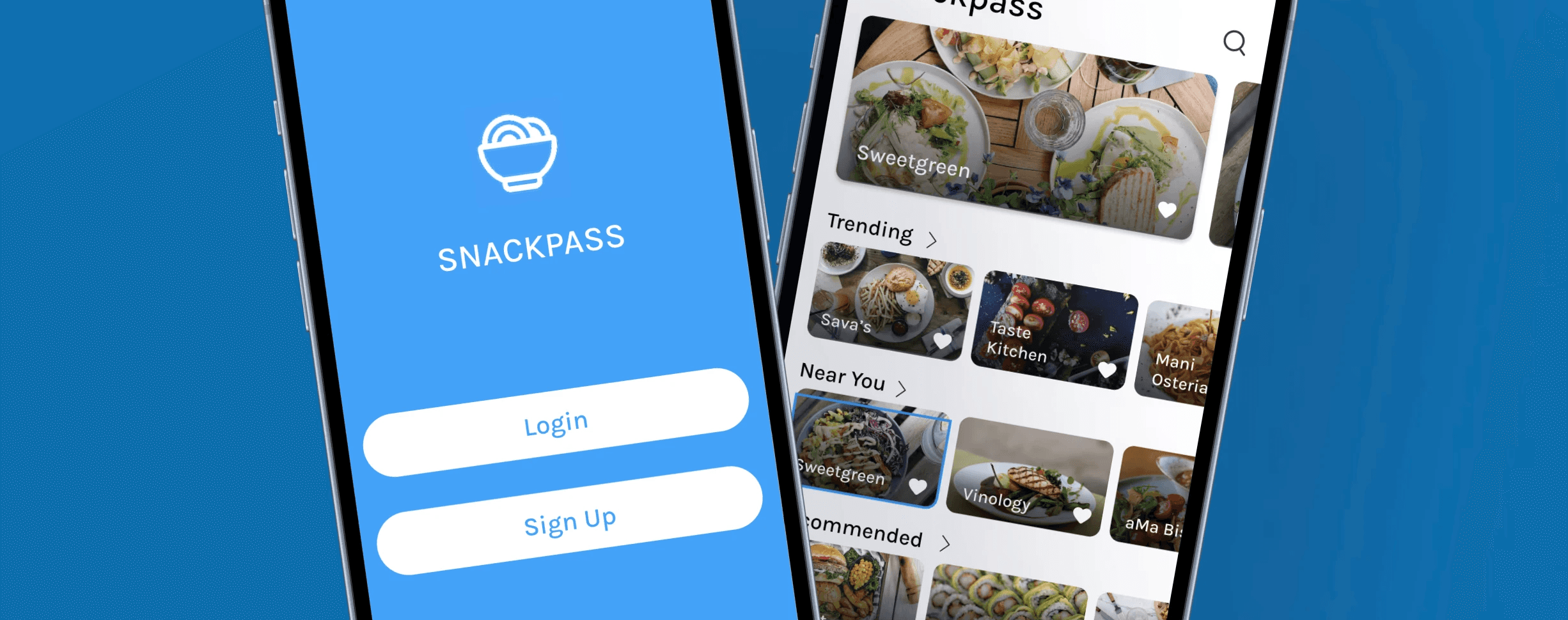
Creating a more visual and dynamically personalized food-ordering experience
Creating a more visual and dynamically personalized food-ordering experience


RESEARCH
RESEARCH
Research focused on understanding user expectations around personalization and usability in food-ordering apps
Research focused on understanding user expectations around personalization and usability in food-ordering apps
To guide the redesign, I conducted user interviews and competitive analysis to uncover what users value most when ordering food digitally. The goal was to understand how visual design, customization options, and personalized recommendations influence engagement and satisfaction.
To guide the redesign, I conducted user interviews and competitive analysis to uncover what users value most when ordering food digitally. The goal was to understand how visual design, customization options, and personalized recommendations influence engagement and satisfaction.
Key Research Goals
Key Research Goals
Identify common frustrations and needs when using food-ordering apps
Understand how personalization impacts user decision-making and retention
Explore how visual design and information hierarchy affect usability
Analyze competitor strategies that successfully drive user engagement
Identify common frustrations and needs when using food-ordering apps
Understand how personalization impacts user decision-making and retention
Explore how visual design and information hierarchy affect usability
Analyze competitor strategies that successfully drive user engagement
Surveys
Surveys
A user survey uncovered preferences, behaviors, and frustrations with current food-ordering apps
A user survey uncovered preferences, behaviors, and frustrations with current food-ordering apps
To complement qualitative research, a survey was conducted to gather broader insights into how users interact with food-ordering platforms. The results highlighted what users value most in their ordering experience and revealed common pain points that limit engagement.
To complement qualitative research, a survey was conducted to gather broader insights into how users interact with food-ordering platforms. The results highlighted what users value most in their ordering experience and revealed common pain points that limit engagement.
Key Takeaways
Key Takeaways
Users want greater control and flexibility when customizing orders
Visual elements such as photos and ingredient tags help users decide faster
Lack of personalization leads to repetitive and less engaging experiences
Many users rely on other platforms that offer better recommendations and variety
Users want greater control and flexibility when customizing orders
Visual elements such as photos and ingredient tags help users decide faster
Lack of personalization leads to repetitive and less engaging experiences
Many users rely on other platforms that offer better recommendations and variety
Competitive Analysis
Competitive Analysis
Analyzing competitors to identify gaps and opportunities in personalization and user experience
Analyzing competitors to identify gaps and opportunities in personalization and user experience


A competitive analysis was conducted to evaluate how leading food-ordering apps approach personalization, customization, and overall usability. The review revealed that most competitors emphasize visual browsing, clear navigation, and tailored recommendations — areas where Snackpass had room to improve. These insights helped define design priorities and guided decisions around feature implementation and interface structure.
A competitive analysis was conducted to evaluate how leading food-ordering apps approach personalization, customization, and overall usability. The review revealed that most competitors emphasize visual browsing, clear navigation, and tailored recommendations — areas where Snackpass had room to improve. These insights helped define design priorities and guided decisions around feature implementation and interface structure.
Research Summary
Research Summary
Research revealed confusion, lack of personalization, and navigation challenges
Research revealed confusion, lack of personalization, and navigation challenges
Users described Snackpass as confusing and overwhelming, citing poor navigation and organization of restaurants and categories. The absence of filtering, sorting, and customization features made browsing inefficient, while the lack of personalized recommendations limited engagement.
Users described Snackpass as confusing and overwhelming, citing poor navigation and organization of restaurants and categories. The absence of filtering, sorting, and customization features made browsing inefficient, while the lack of personalized recommendations limited engagement.
Key user goals included a faster, more convenient ordering process, improved navigation, and personalized recommendations based on preferences and past orders. Users also wanted easier restaurant discovery through curated deals and trending suggestions.
Key user goals included a faster, more convenient ordering process, improved navigation, and personalized recommendations based on preferences and past orders. Users also wanted easier restaurant discovery through curated deals and trending suggestions.
DELIVERABLES
DELIVERABLES
Based on my research findings, I created several deliverables to guide the app’s redesign
Based on my research findings, I created several deliverables to guide the app’s redesign
Insights from research informed a series of design artifacts that shaped Snackpass' redesign and user experience. These included user personas, journey maps, and user flows that helped define user needs, key features, and opportunities to simplify planning and discovery.
Insights from research informed a series of design artifacts that shaped Snackpass' redesign and user experience. These included user personas, journey maps, and user flows that helped define user needs, key features, and opportunities to simplify planning and discovery.
USER PERSONAS
USER PERSONAS
Developed primary persona representing Snackpass’s target user
Developed primary persona representing Snackpass’s target user


Based on research insights, I created one primary user persona that captured key goals, behaviors, and frustrations around food ordering and personalization. This persona guided design decisions to align the app with user needs.
Based on research insights, I created one primary user persona that captured key goals, behaviors, and frustrations around food ordering and personalization. This persona guided design decisions to align the app with user needs.
JOURNEY MAP
JOURNEY MAP
Mapped the user journey to understand behaviors, emotions, and pain points throughout the planning process
Mapped the user journey to understand behaviors, emotions, and pain points throughout the planning process


The journey map outlined user actions, thoughts and emotions, pain points, and needs or opportunities across each stage of making plans. This helped visualize the full planning process and identify where users faced the most friction or needed additional support.
The journey map outlined user actions, thoughts and emotions, pain points, and needs or opportunities across each stage of making plans. This helped visualize the full planning process and identify where users faced the most friction or needed additional support.
User Flow
Mapping the user flow to streamline the ordering experience
Mapping the user flow to streamline the ordering experience


I designed a user flow to outline each step from browsing restaurants to completing an order. This process clarified decision points, reduced unnecessary steps, and ensured the overall experience felt intuitive and efficient.
I designed a user flow to outline each step from browsing restaurants to completing an order. This process clarified decision points, reduced unnecessary steps, and ensured the overall experience felt intuitive and efficient.
DESIGN & IDEATION
DESIGN & IDEATION
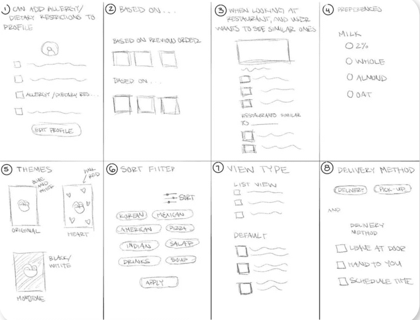
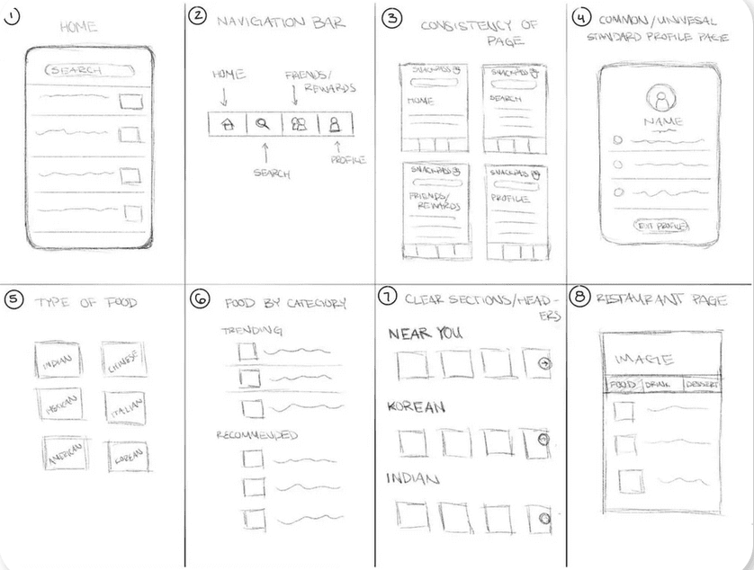
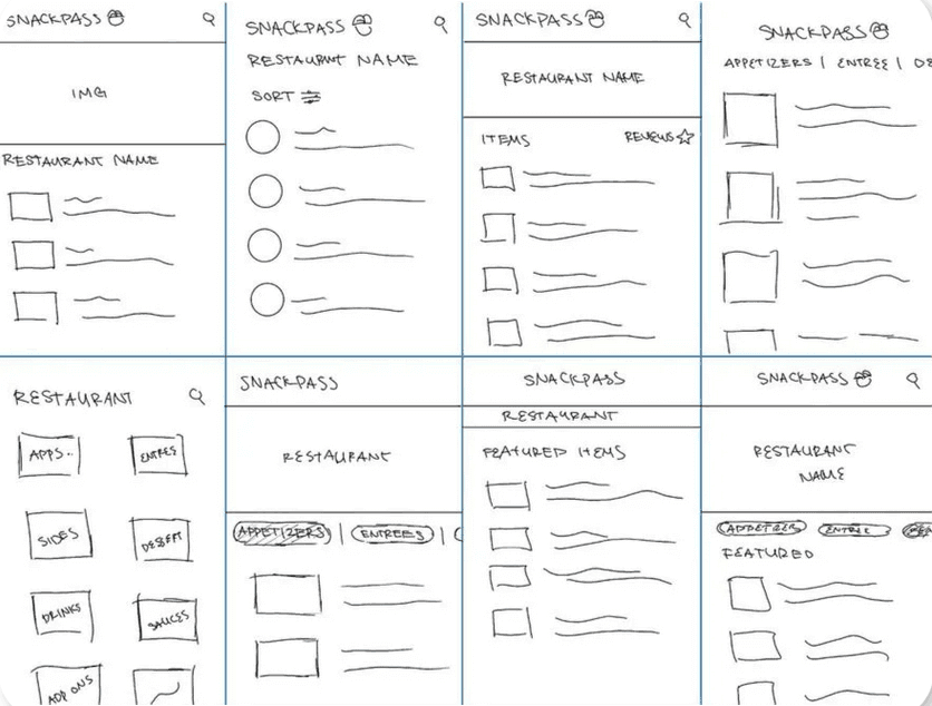
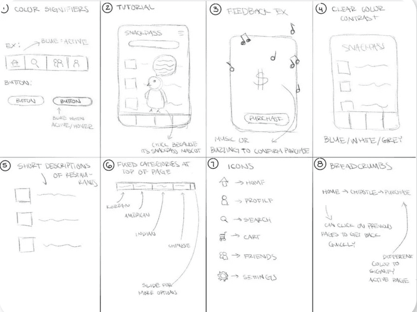
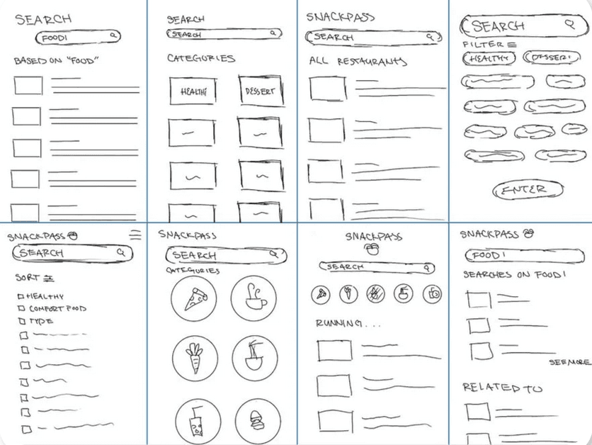
Explored multiple rounds of sketches to generate and refine design ideas
Explored multiple rounds of sketches to generate and refine design ideas
Content should reflect user preferences


Home Page
Home Page
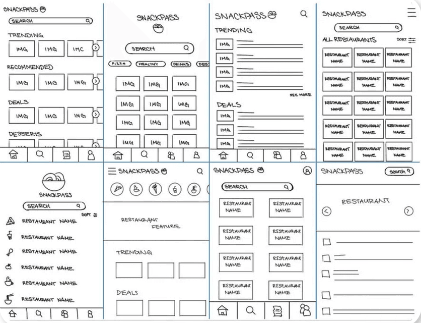


Information should be presented in a clear and organized manner


Restaurant Page
Restaurant Page


Users should be able to easily interact with the interface



Search and Category Pages





FINAL DESIGN
FINAL DESIGN
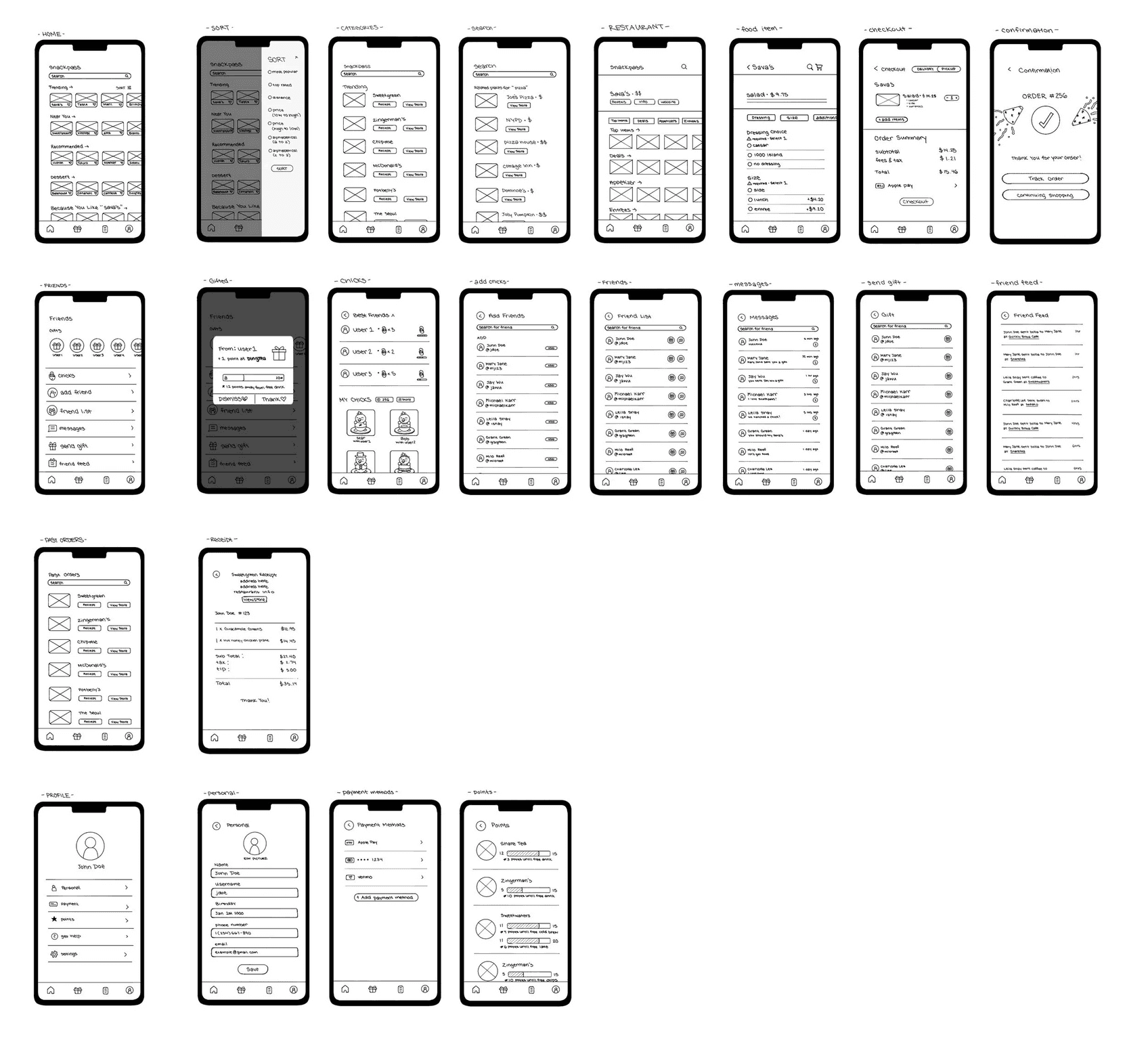
A final design that turns indecision into confident action
A final design that turns indecision into confident action
Getting Started
Getting Started
Onboarding Process
Onboarding Process
Landing page upon opening Snackpass app.
Landing page upon opening Snackpass app.


EXPLORE EXPERIENCES
EXPLORE EXPERIENCES
Discover New Restaurants
Discover New Restaurants
Home page where users can browse various restaurants and cafes.
Home page where users can browse various restaurants and cafes.
Restaurant Page
Restaurant Page
Greater Customization
Greater Customization
Users can customize their orders based on their dietary needs and preferences.
Users can customize their orders based on their dietary needs and preferences.


POST ORDER EXPERIENCE
POST ORDER EXPERIENCE
Checkout and Confirmation
Checkout and Confirmation
Allows users to review their order and delivery method one final time before checking out.
Allows users to review their order and delivery method one final time before checking out.
Personal Additions
Personal Additions
Profile and Chicks
Profile and Chicks
Enables further customization and social interaction through features like Chicks and sending points to friends.
Enables further customization and social interaction through features like Chicks and sending points to friends.


REFLECTION
REFLECTION
From my first full UX project, I learned how much intentionality is required when creating solutions. They should be based on research and tests that were conducted
From my first full UX project, I learned how much intentionality is required when creating solutions. They should be based on research and tests that were conducted